Where This Started
My last two quarters at Drexel, I was applying for internships. Every time I sent something off there was this window — like okay, maybe this one. Then a day would pass. Then a week. I was checking my email first thing in the morning before I even got out of bed. Around 30% of the places I applied to sent a rejection. The rest just went quiet.
I talked to friends and everyone had the same thing going on. Me and Disha were doing our capstone together and it felt obvious — we weren't looking for a problem to solve, we were already living it. We wanted to build something that actually made employers respond. Not a better job board. A platform where accountability was part of how it worked.
The Dual Problem
Hiring platforms care about volume. More listings, more applications — that's how they look successful. They don't measure what it costs the people actually using them. We talked to people on both sides to figure out where it was breaking down.
For Job Seekers
You put time into an application, send it off, and just wait. Most of the time nothing comes back. You don't know if they read it, if the role's already filled, if it even landed anywhere.
- Privacy: A lot of people are looking while they're still employed. They can't risk their current company finding out — and most platforms do nothing to protect that.
- Application fatigue: Every platform has a different process. You end up entering the same information five different ways and it just wears you out.
- Bias upfront: Asking for visa status or photos before any real evaluation has happened just opens the door to profiling.
For Employers
Smaller companies are basically invisible next to the big names. And when applications do come in, a lot of them aren't actually a fit — people just apply everywhere.
- Validating skills: Resumes say whatever the person wants them to say. You can't tell from a PDF whether someone actually knows what they claim to know.
- Culture fit: Genuinely hard to gauge from a document. It just is.
- Screening takes too long: Even with knockout questions, going through hundreds of applications manually takes weeks. Some platforms average 30+ days just for onboarding a new hire.
Research & Personas
We went through LinkedIn, Monster, Indeed, ZipRecruiter, a bunch of them — including some smaller ones like JobSwipe. The pattern was the same everywhere. Every platform makes you fill out a ton of information before anything actually happens. The friction comes first, the connection comes later, if at all.
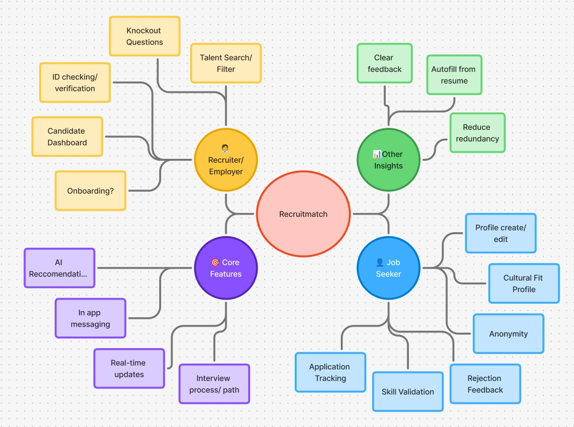 Feature ideation — the full scope mapped across four clusters: recruiter tools, job seeker experience, core platform features, and product insights.
We mapped out the experience as a journey — what's the person feeling at each stage. The lowest point wasn't rejection. It was right after sending the application, that stretch where you have no idea what's happening on the other end.
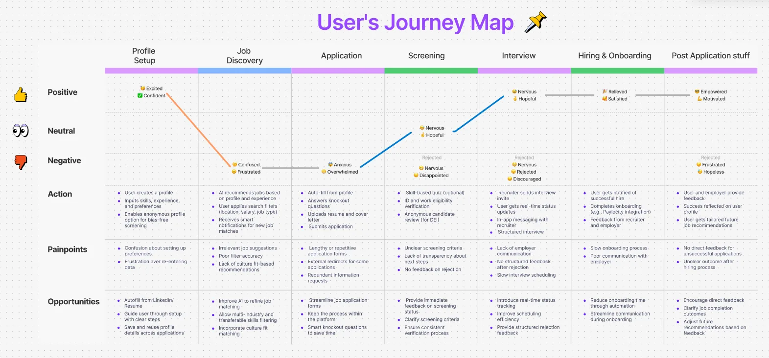 User’s journey map — the lowest emotional point wasn’t rejection. It was the silence after the initial application.
The Pivot That Changed Everything
About two weeks in, we hit a wall. Our whole idea was a swipe-based matching app — and then we found out it already existed. JobSwipe, Source, Joinu. Someone had basically already built Tinder for jobs.
So we went back to what we kept hearing in research. The word that came up over and over was accountability. Employers weren't ghosting people because they're careless. They were doing it because nothing in any platform required them not to. There was literally no reason to reply.
Key Design Decisions
1. The 72-Hour Response Window
The idea was simple — what if responding was just required? Once there's a mutual match, the employer has 72 hours to reach out. Hard deadline. No opt-out. During testing, recruiters with a lot of open roles found it stressful, so we added a one-time 48-hour extension. But the rule stays. You matched with someone, you have to do something about it.
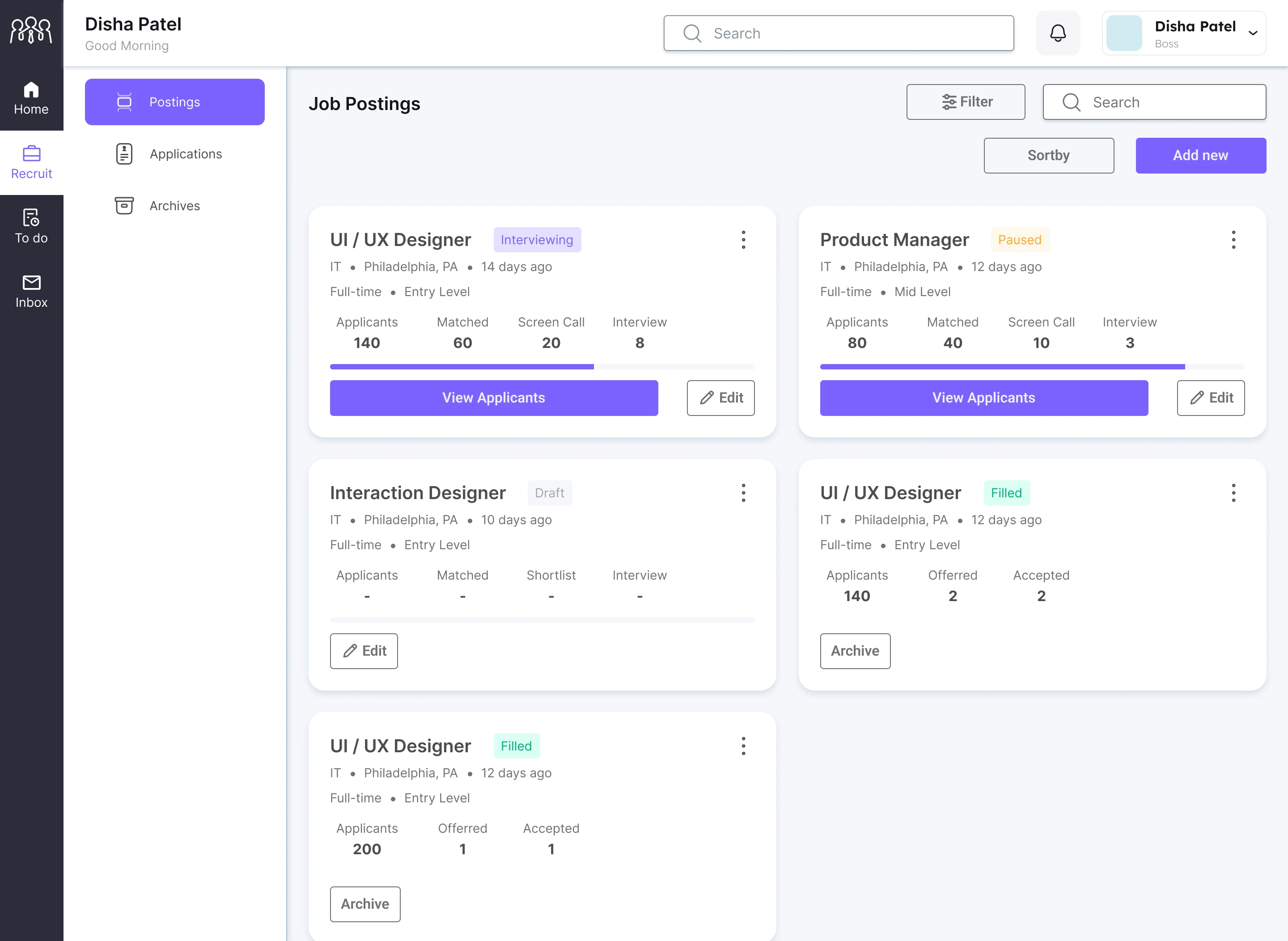 Job postings board — every listing shows where candidates stand across the funnel in real time.
2. Anonymous Profiles Until Match
I've had people tell me they skip applications just from reading a name that sounds international. Which is obviously bad, but it happens. So the employer sees your skills, experience, and match score — not your name, not a photo. Nothing that makes profiling easy. The full profile only unlocks after both sides agree to match. It also means people who are quietly looking while still employed can do that without it getting back to their current company.
 The job seeker sees the role and company. The employer sees only skills and match score. Identity is withheld until both sides agree.
3. Post-Swipe Knockout Questions & ID Verification
Dealbreaker questions — visa status, location, clearances — are awful to answer before you've even seen a job description. But skipping them wastes everyone's time when they come up later. We moved them to after the swipe, before the match confirms. Short, five to seven questions. Our first version was too formal and people bounced. We simplified the language a lot and it got much better. The same onboarding step includes ID verification — you scan your ID once, it stays on your profile, and recruiters get some baseline trust without you handing over anything to a stranger.
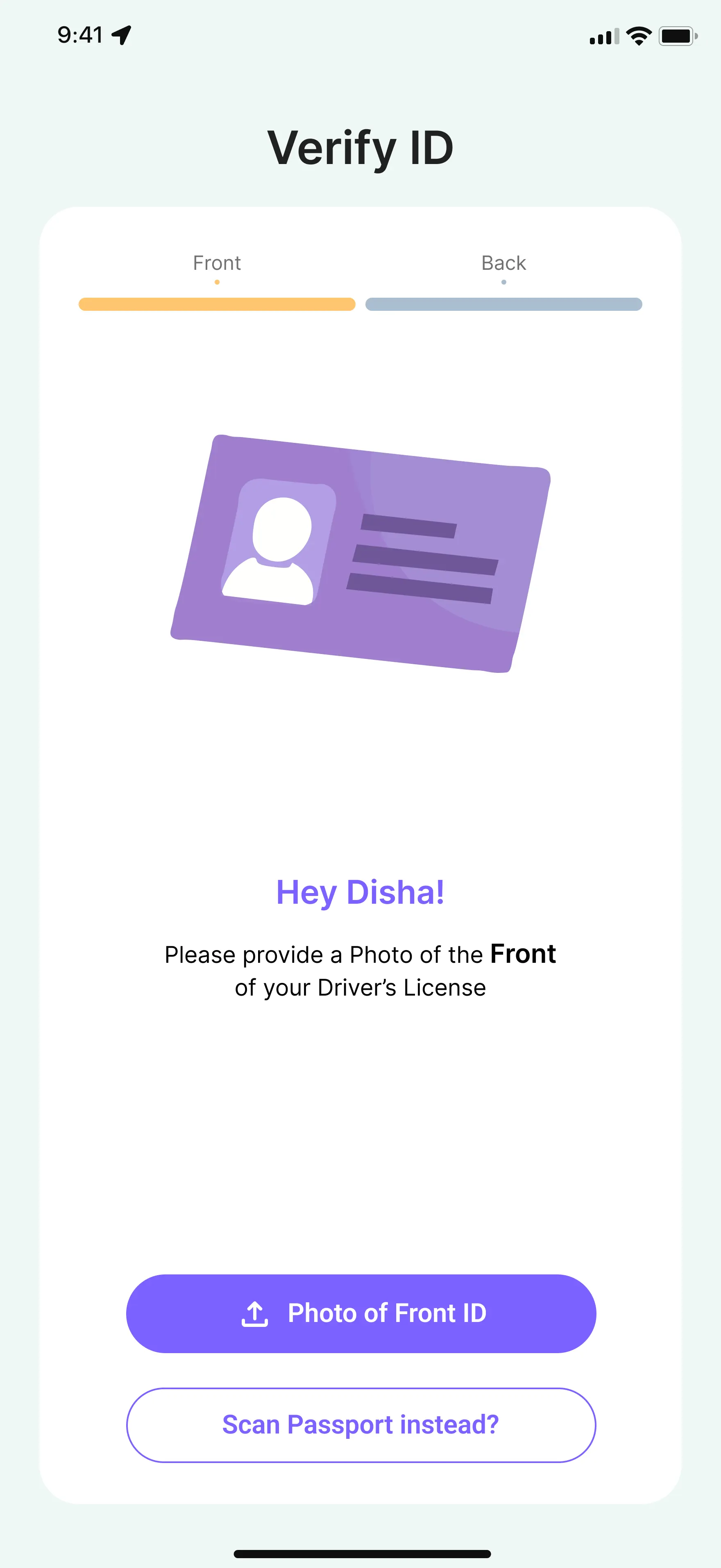 Identity verification during onboarding — trust is established before the match, not after a problem surfaces.
4. In-App Messaging After Match
Once you match, you shouldn't have to swap LinkedIn profiles or emails to talk. Everything happens inside Recruitmatch — employer goes first, that's the rule. The whole conversation stays tied to the application so both sides have context. On most other platforms, the moment you "contact" someone you're basically leaving the product. We kept it contained.
 In-app messaging — the employer reaches out first, always. No contact information exchanged until both sides are ready.
5. Application Tracking
The tracker was probably the feature I cared most about personally. Your application isn't just disappearing into a void — you can see if the role is still open, if it's been filled, where you are. Even seeing "Closed" on something is better than nothing. At least you can move on. I spent so long refreshing my email for jobs that were probably filled the week I applied.
Algorithms & Architecture
While the UI feels like a lightweight swipe app, the backend requires heavy lifting to ensure the matches are actually viable. The platform’s matching engine leverages a deep algorithmic stack:
- NLP Models: BERT, Transformer architectures, and DistilBERT parse resume bio data against job descriptions.
- Relevance Scoring: TF-IDF and Matrix factorization ensure high-fidelity skill matching.
- Feedback Loops: Neural collaborative filtering adapts the feed based on the recruiter's left/right swipe history.
Employers define a required skill match threshold. Candidates whose attributes meet or exceed that threshold are prioritized in the discovery feed. This allows a three-person startup with a highly specific tech stack (e.g., AWS, Python, WebGL) to reach exactly the right people, completely bypassing the visibility advantage of massive corporations.
The Final Prototype
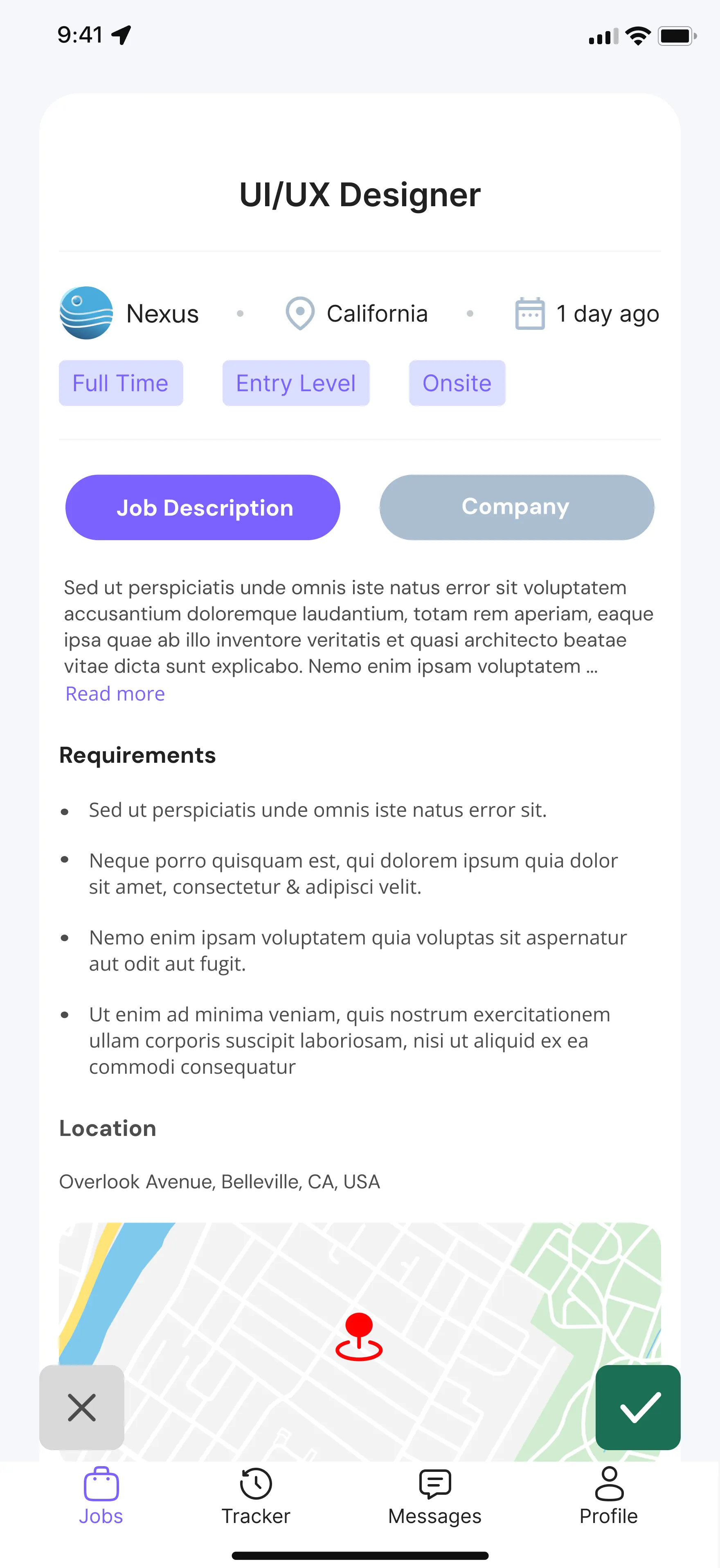
The job seeker side is all mobile — you're on your phone, swiping through jobs, checking the tracker. The employer side is web because recruiters are at a desk managing several open roles at once. Two different contexts, two different designs. The one thing that stays consistent: the employer reaches out first. Always.
Employer — Web Dashboard
Recruiters are managing multiple open roles at once, so the dashboard needed to make that readable fast. Total applicants, matched candidates, today's interviews — all on one screen, with the calendar right there.
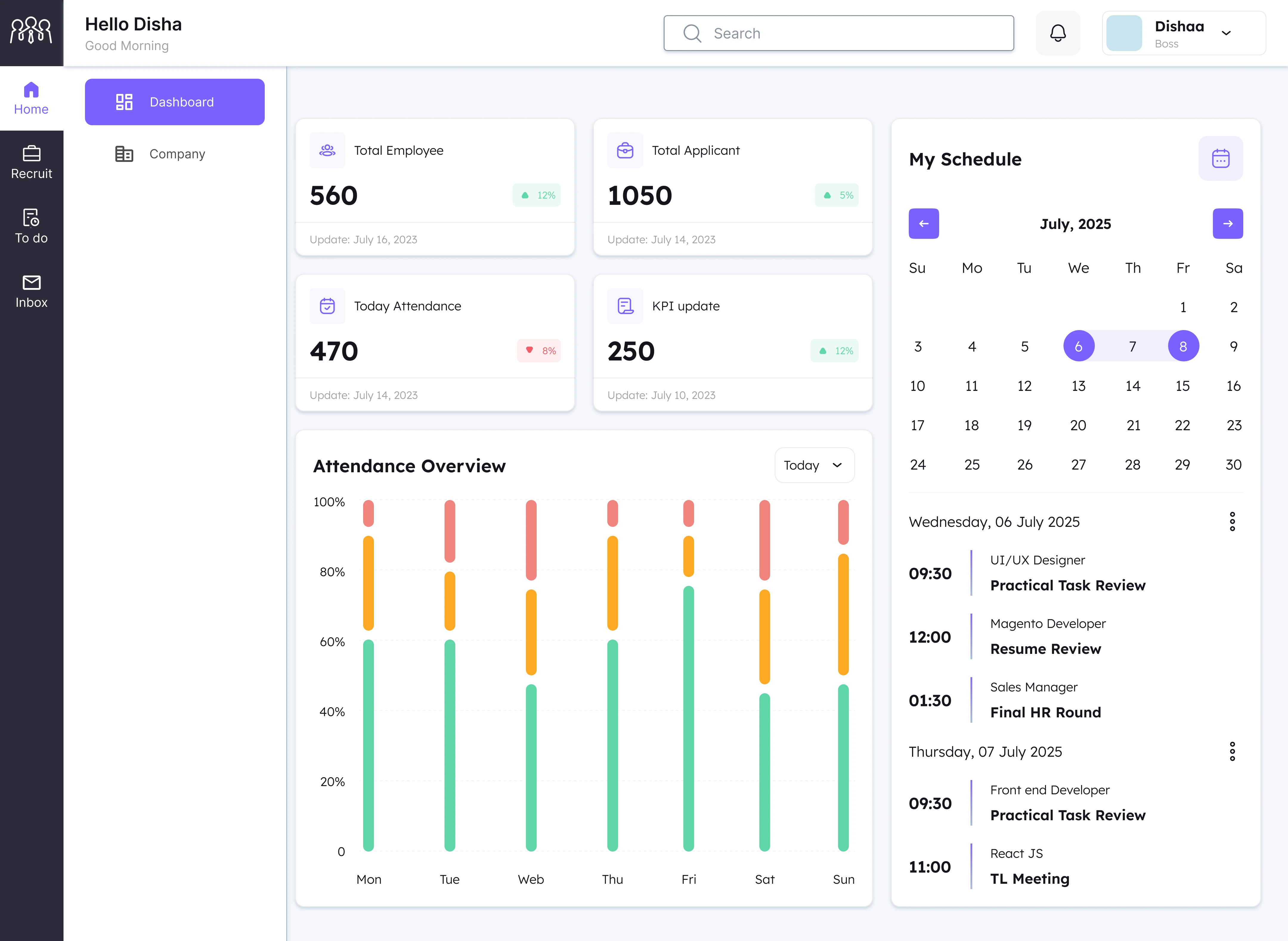 Employer dashboard — pipeline health at a glance, with the interview schedule anchored to the right.
Candidates can be viewed as a ranked list or a Kanban board. List view sorts by match score so the strongest candidates surface first. The Kanban breaks it down by stage — Applied, Match, Interview — which makes it easier to see who needs attention before the 72-hour clock runs out.
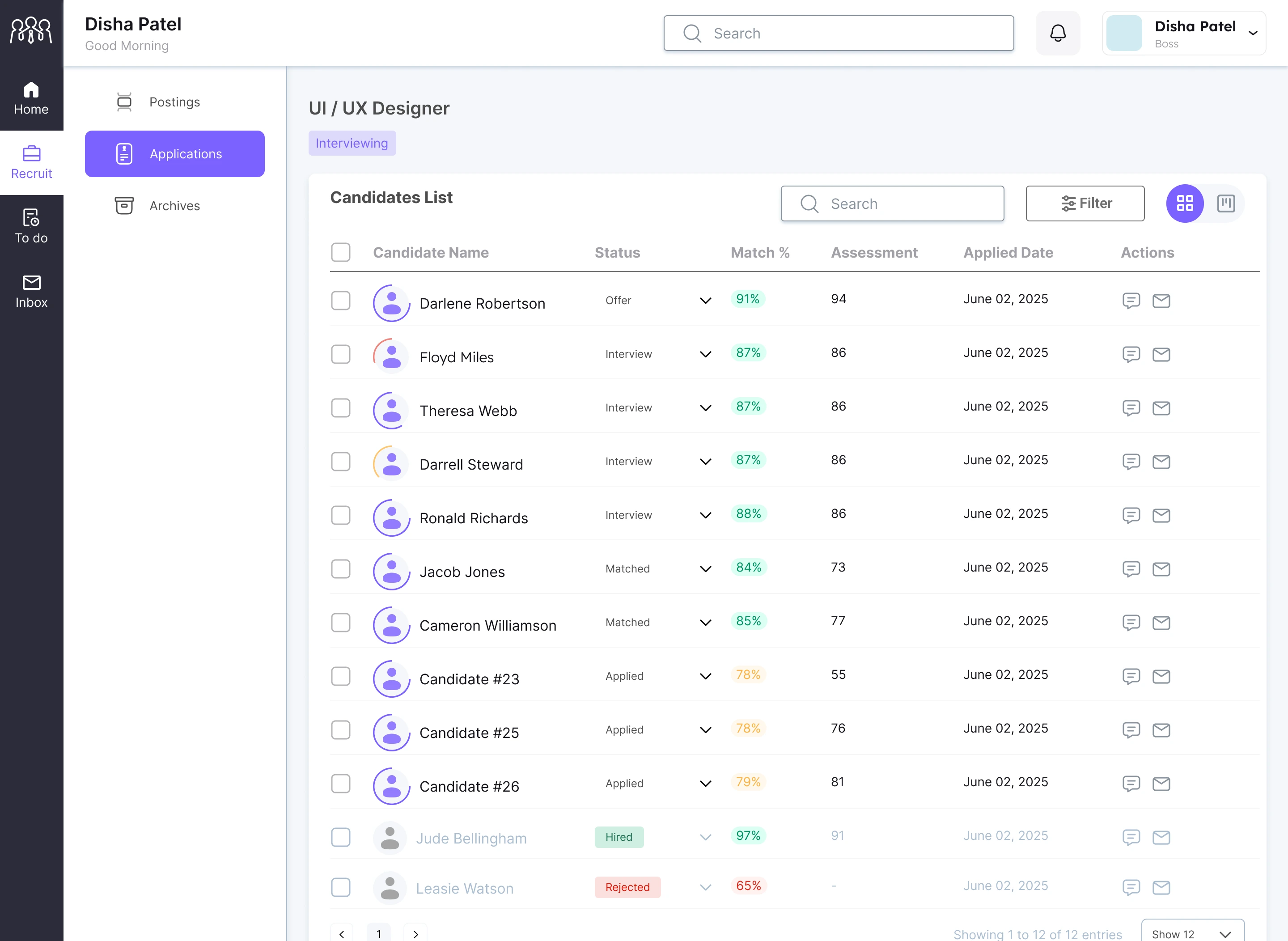 Candidate list — sorted by match %. Anonymous placeholder names for lower-scored candidates are revealed only after they clear the match threshold.
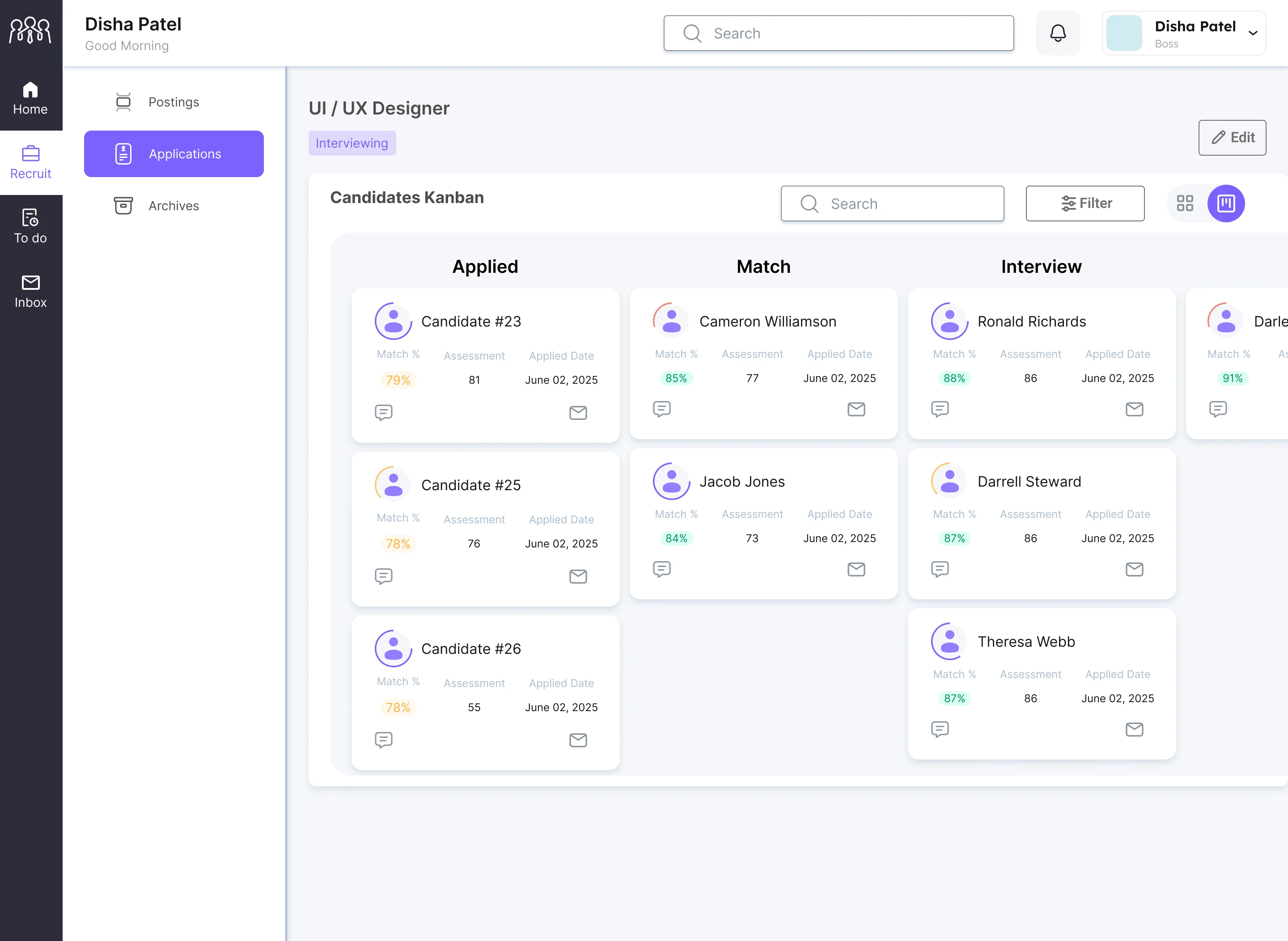 Kanban pipeline view — at a glance, which candidates are matched and which need a decision today.
Opening a candidate brings up everything in one place — match score, assessment, skill tags, timeline. The actions are right at the top: Message, Email, Reject. The recruiter has to make a call. The candidate gets an answer either way.
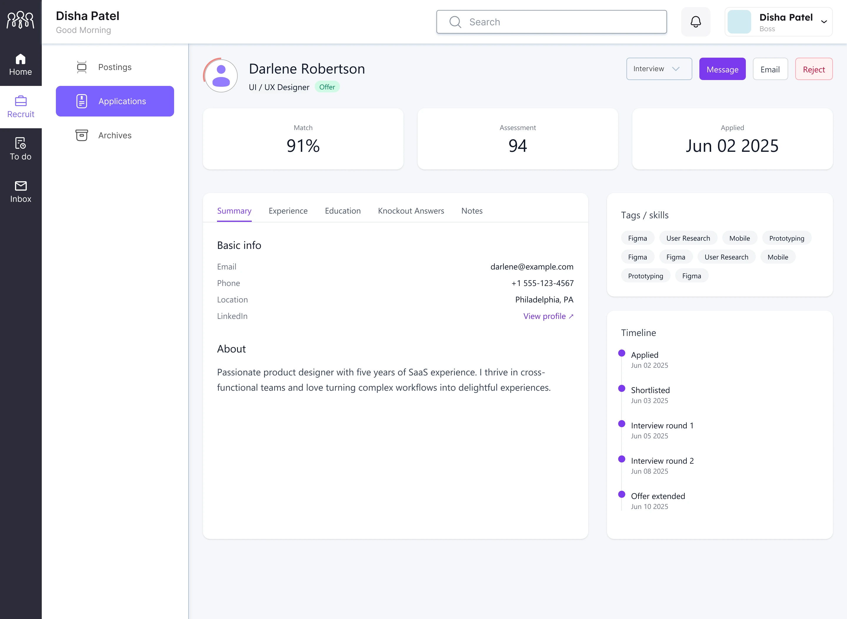 Candidate profile — match %, assessment score, skill tags, and full timeline. One screen, everything needed to make a call.
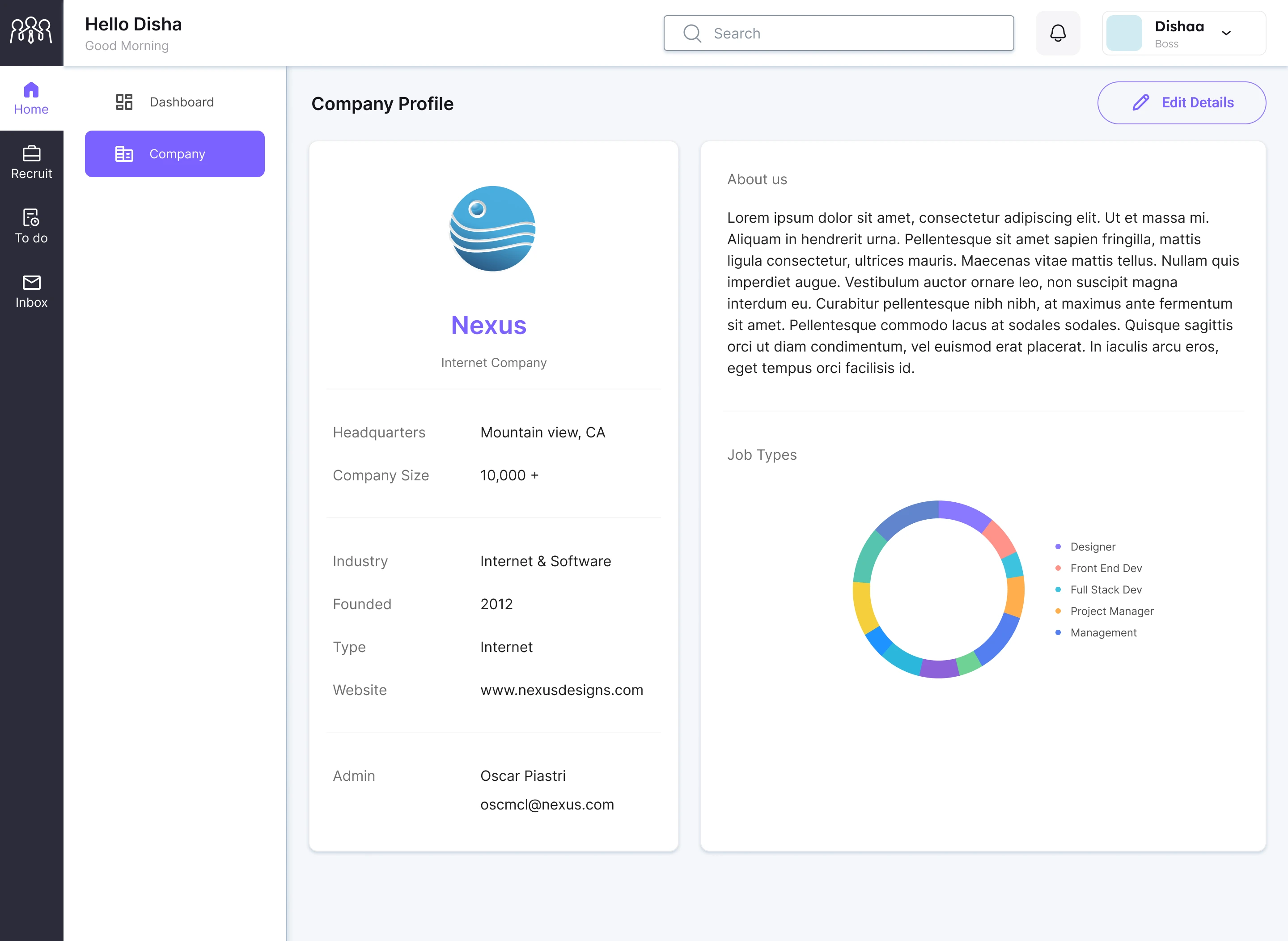 Company profile — visible to candidates after a match, so they can verify the company before they engage.
The Bottom Line
Ghosting happens in hiring because nothing in the platform stops it. It's not that recruiters are bad people — it's that they have no reason to respond, so a lot of them don't. The 72-hour rule is annoying if you're managing 200 open positions. I get that. But from the other side of that process, at least you know something is coming.
Me and Disha built this during two quarters of our capstone and I'm genuinely proud of it. Not because it's technically impressive, but because it came from a real place. I was that person refreshing their inbox. I still am, sometimes.
The problem is solvable. It just needed someone to actually build the accountability in.
Next Case Study
FREDDY AI →