Two Problems, One Child
When a kid comes into the ER and can't communicate what's wrong, most hospitals rely on the language line. You call a number, wait for an interpreter, and then ask a scared 6-year-old to describe their symptoms through a speakerphone to a complete stranger. That barely works for adults. For kids it basically doesn't work at all.
The thing that really got us was this: kids as young as 4 were acting as the translator between their parents and the doctor. A kid who's scared, in pain, somewhere they've never been — being asked to explain medical things they don't fully understand, in their second language.
My Role
Me and Lem and McKiba split the work, but I ran most of the research side — interviews, synthesis, figuring out what we were actually trying to build. I also took the prototype from the first paper sketches all the way through to the final hi-fi, and ran the usability tests with the kids and nurses.
Understanding the Space
Before we touched Figma, we spent four weeks just talking to people — everyone who actually had to deal with a pediatric ER visit:
What the Numbers Said
- Takes more time, slows ER pace
- Risk of misdiagnosis
- No access to full medical history
- Can't communicate symptoms clearly
- Worried accent causes misunderstanding
- No time to learn new methods
- Not tech savvy
- Child acts as translator for parent
- Speak in mother tongue
The Insight That Changed Our Direction
We started thinking the solution was just a better translation tool. Something faster and simpler than the language line.
But something kept coming up in the interviews: a panicking kid can't really communicate in any language. A 5-year-old who's terrified — you could have perfect translation and it still wouldn't help if they couldn't calm down enough to answer. Anxiety and language were basically the same barrier.
That changed what we were actually designing for:
Ideation: 25 Ideas Across 5 Categories
We ran a full brainstorm across five categories and got to 25 ideas — sensory rooms, puppet shows, VR, 3D anatomy models, interactive storytelling, you name it. Then we went through each one and checked how feasible it was in an actual ER context.
Three of them were strong enough to actually build:
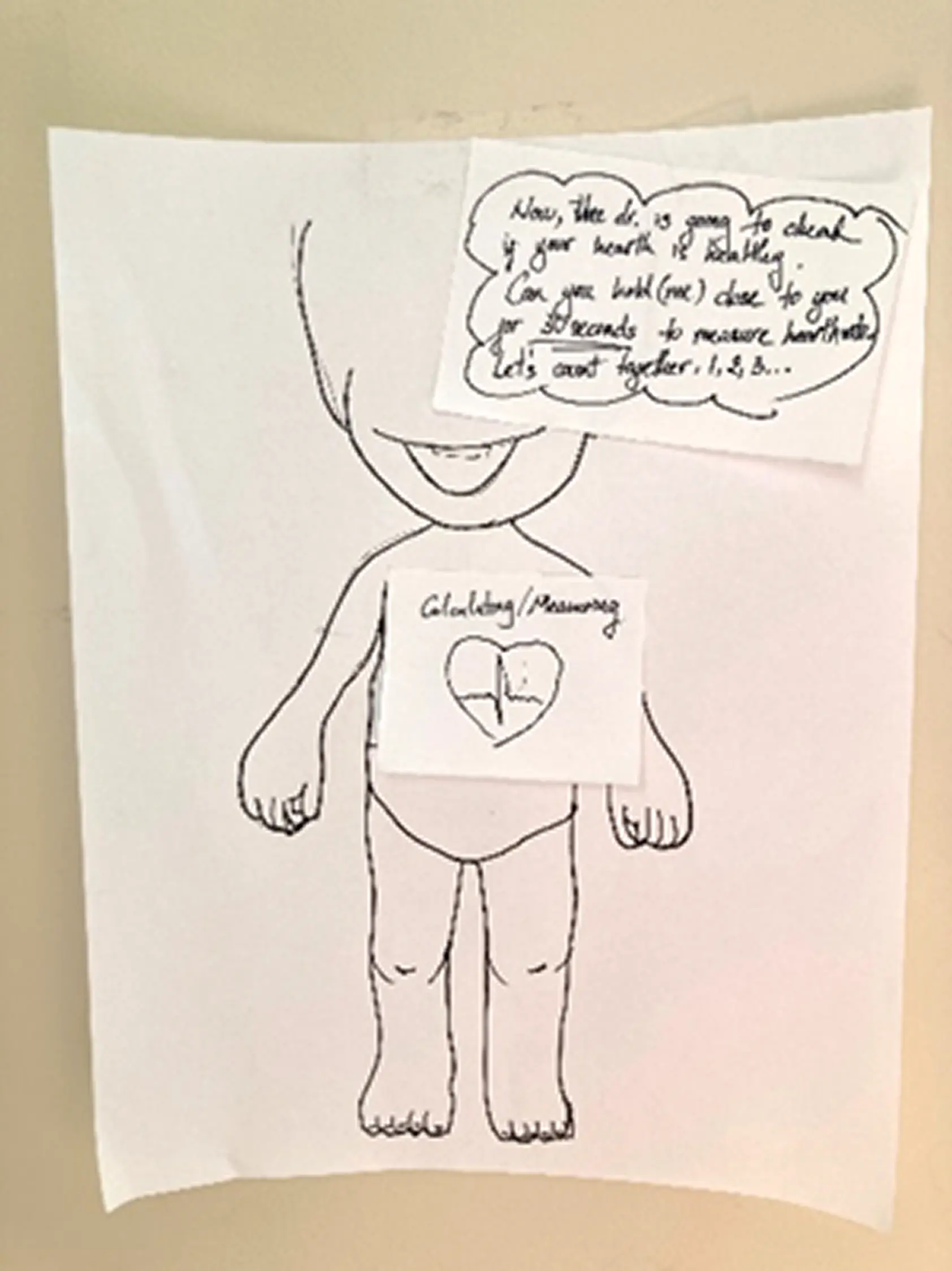
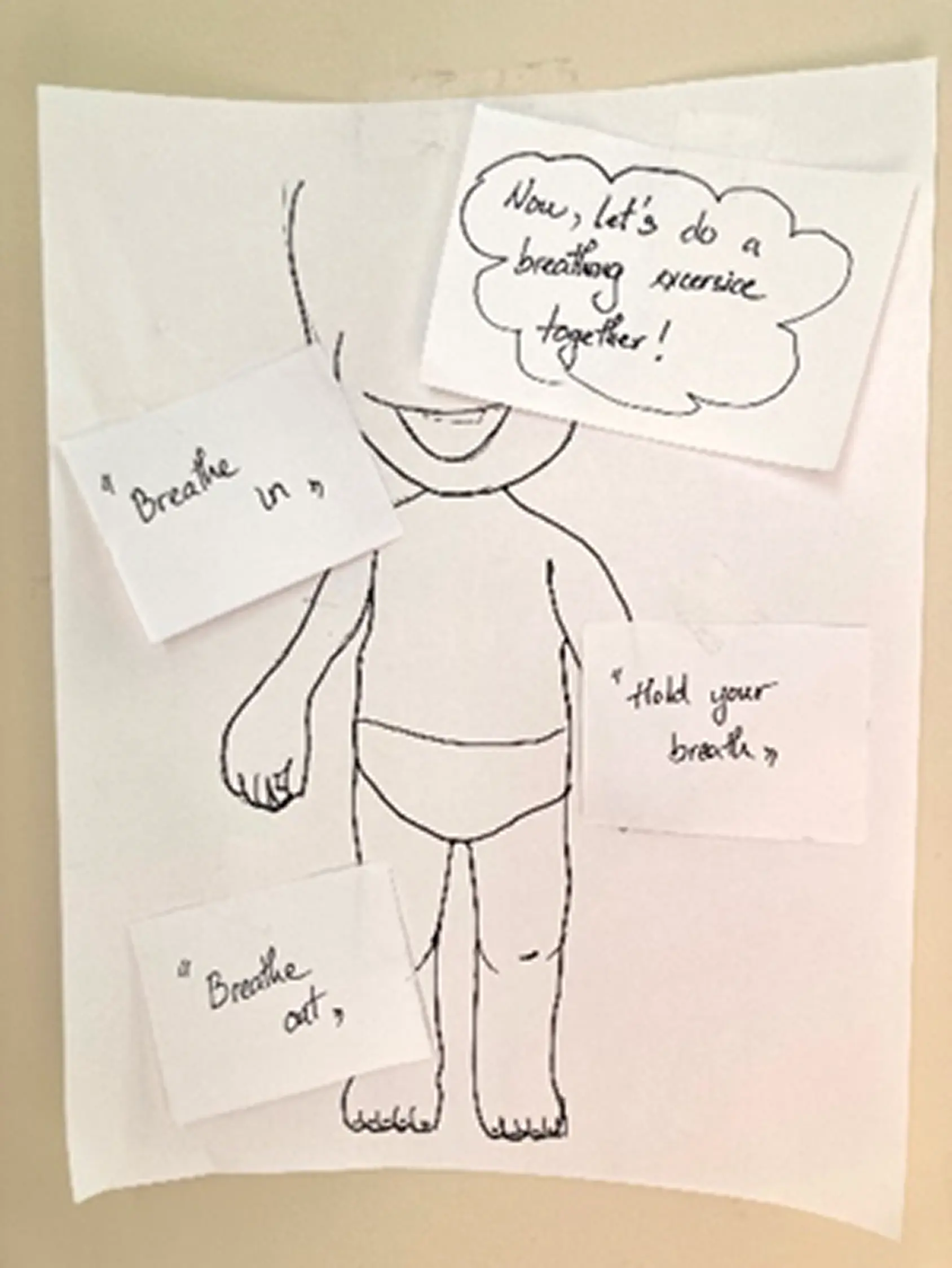
- Child-Friendly 3D Models — Tactile anatomical models a kid can point to instead of describing. Cuts out the language dependence for symptom communication entirely.
- Interactive Storytelling App — A mobile app with child-friendly characters that walks kids through what an ER visit looks like. The idea was to make the unfamiliar familiar before it happens, so the anxiety goes down.
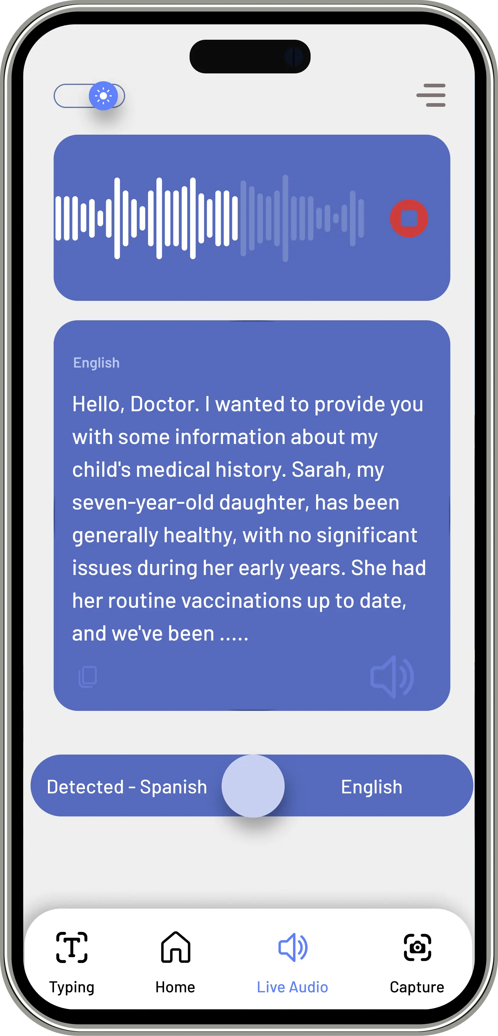
- Mobile Translation Device — A purpose-built translation tool for healthcare workers. Faster than the language line, designed specifically for clinical conversations rather than general use.
None of them covered everything on their own. So we combined all three — the storytelling, the translation, and the child-first interface — and that's basically how KIBA happened.
Prototyping: Sketch → Wireframe → High Fidelity
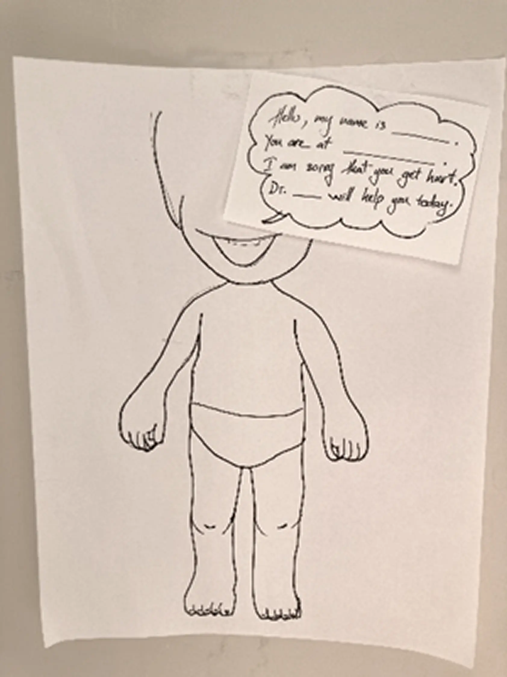
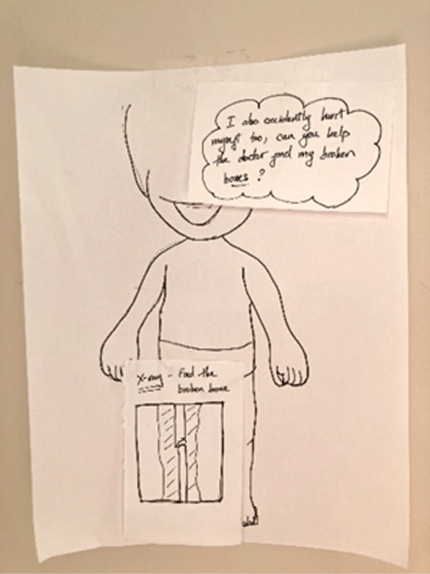
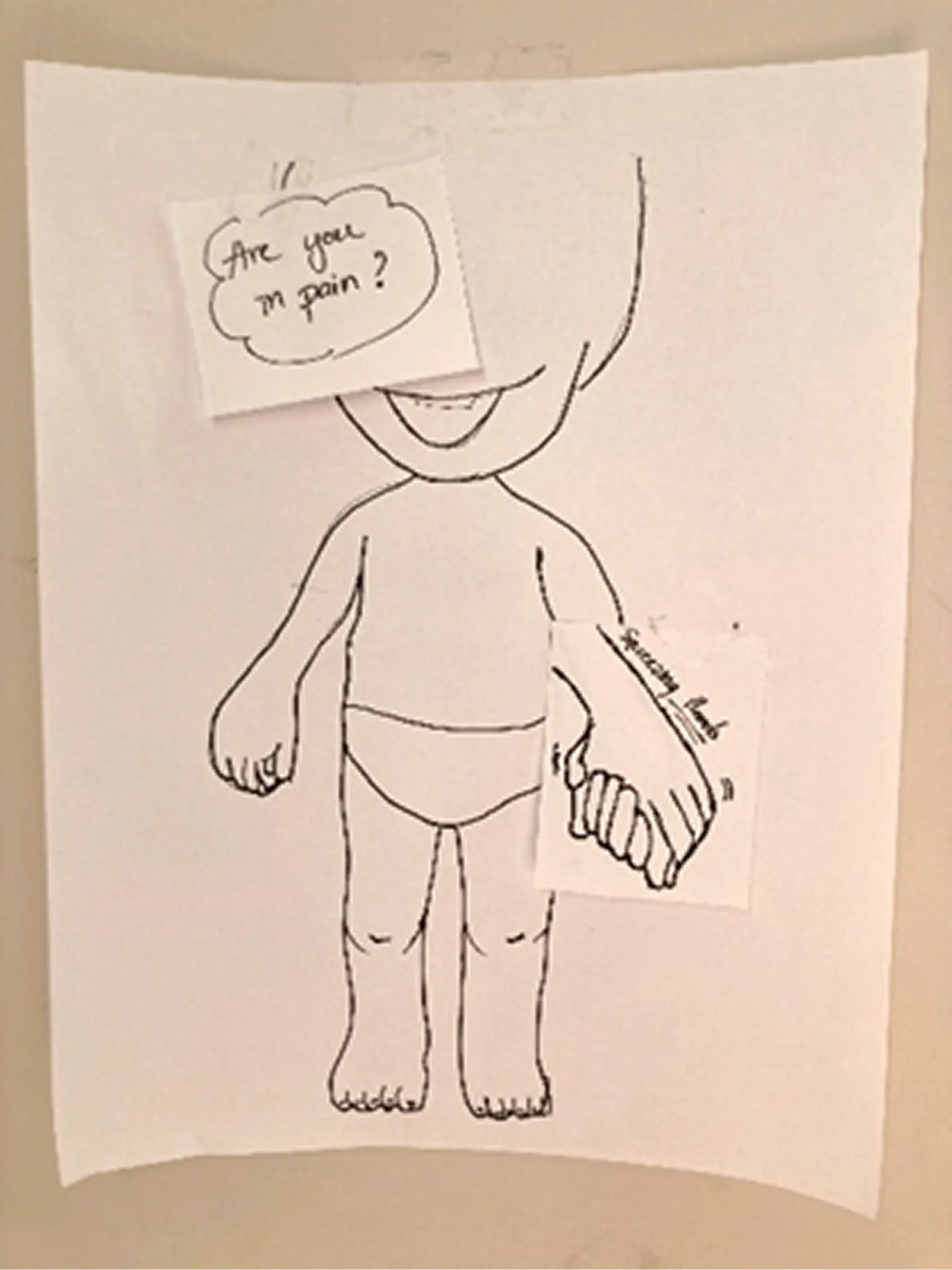
Paper Prototyping First
Before opening Figma, we built rough paper versions of each direction. Quick to throw together, easy to test and toss. The most useful thing we found: kids responded way more to the character than to anything on screen. How the animated figure moved and talked to them mattered more than what it was saying. That shaped basically everything in the hi-fi.
Information Architecture
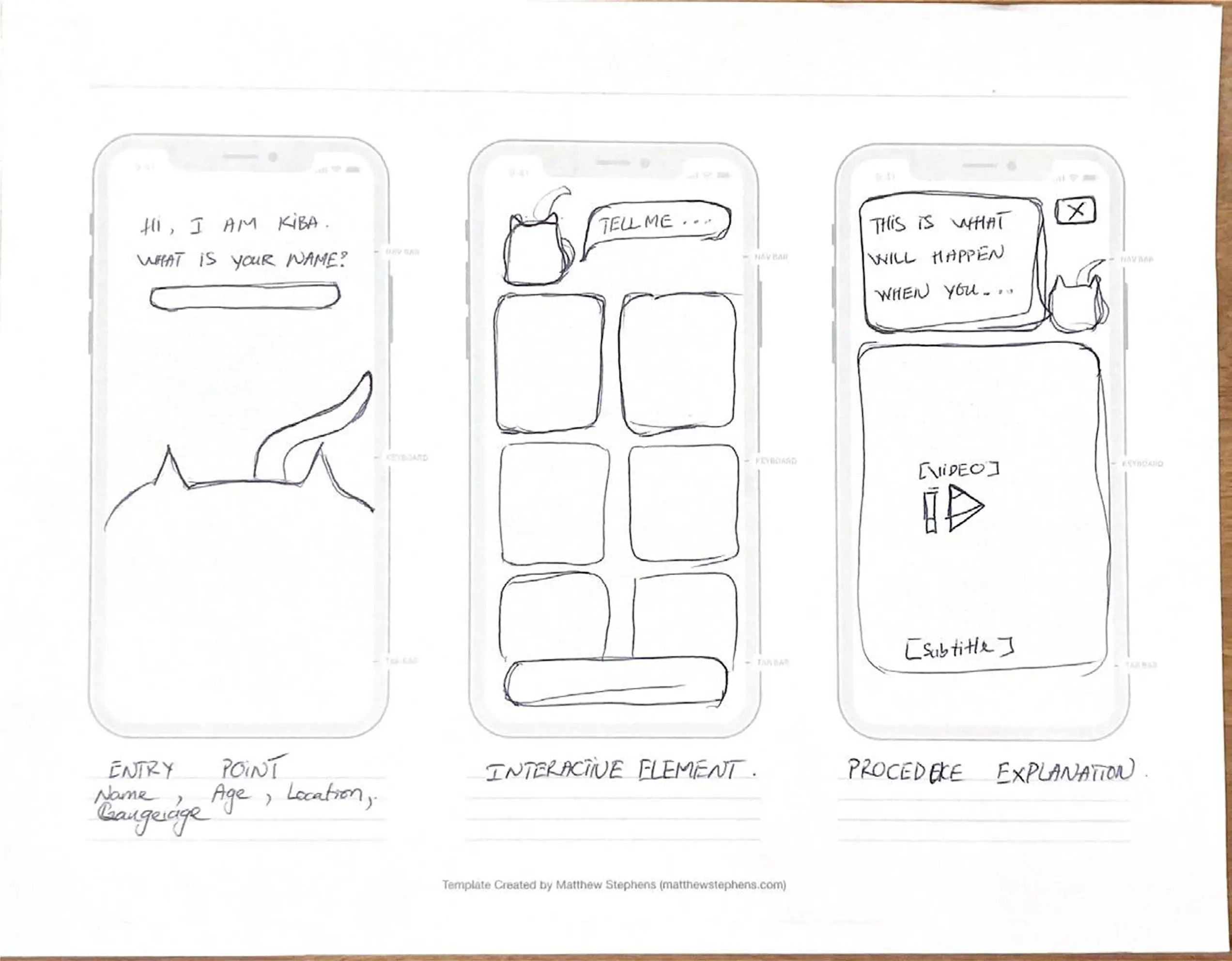
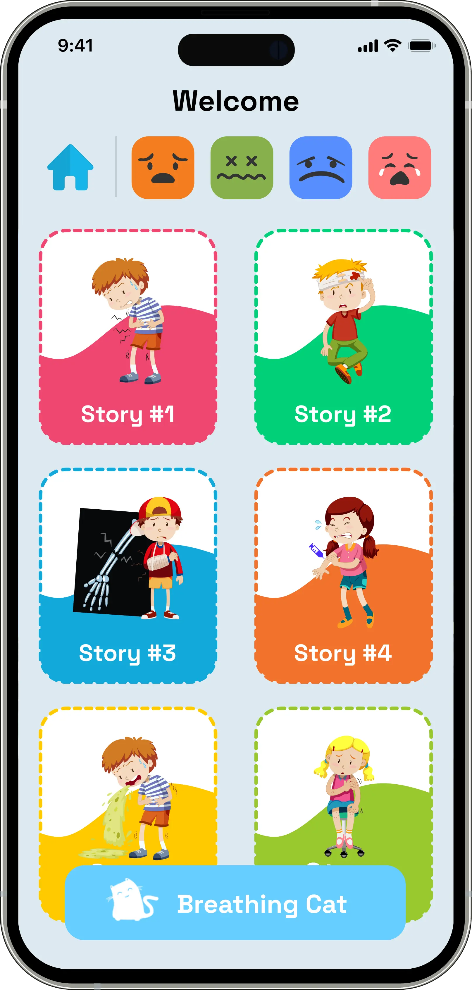
The main structural thing was the critical condition check right at entry — if someone flags something serious, the app immediately surfaces a "Contact Doctor" path instead of going through the regular flow. The nurses specifically told us about triage priority, so that was a direct response to that feedback. After that, home branches into three lanes: Mood-Based Stories, Scenario-Based Stories, and Live Translation.
Low-Fidelity Wireframes
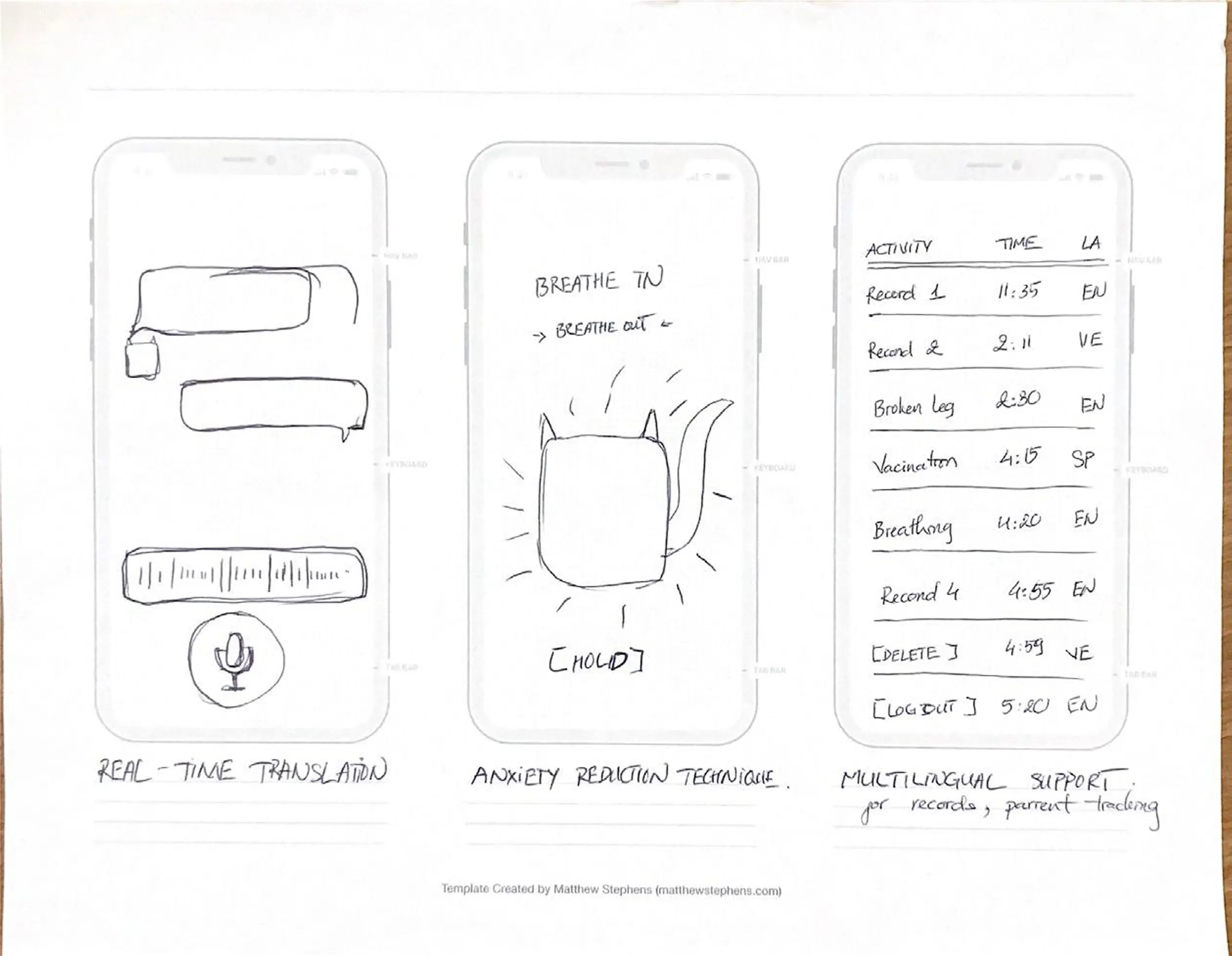
A couple of things came out of this phase: the live translation screen needed a visible waveform, because nurses needed to know the system was actually listening and not just frozen. And the anxiety screen — the breathing exercise — needed to be reachable from anywhere in the app. We anchored the Breathing Cat in the bottom nav of every screen so it was always one tap away.
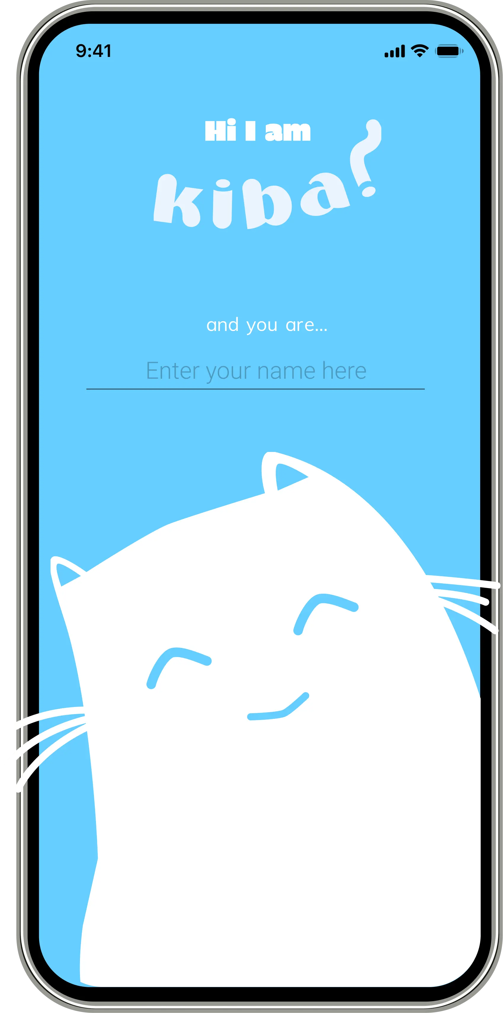
High-Fidelity Prototype
Kid enters their name on the splash screen and KIBA greets them by name from there on — whole onboarding is about 30 seconds. On home, emoji let them say how they're feeling without needing words. And before anything else in the experience: breathing exercise first. Led by an animated cat. We figured out pretty quickly from testing that if a kid is panicking, nothing else works until you get them calm first.
Testing: What We Learned
What Worked
- The Breathing Cat got an immediate, visceral response from every child we tested — no instruction needed
- Emotion-tap navigation required zero onboarding; children as young as 4 understood it intuitively
- Nurses preferred KIBA's speed over the language line in every session
What We Fixed
We assumed nurses would just hand the device to the kid and step back. They corrected that immediately — they needed to see what the child was selecting in real time, otherwise they couldn't respond to it. We added a parallel provider view so nurses could follow along without interrupting the child.
The 3 and 4-year-olds also really struggled with any screen that had text on it. We ended up removing most of the explanatory copy and just let the characters carry the whole thing visually.
Outcome
The core question KIBA was trying to answer was whether you can actually address anxiety and language at the same time — whether one tool can carry both.
Having storytelling, breathing, and translation all in one place covered something existing tools weren't really touching: the kid's emotional state, not just the words they're trying to say. The nurse testing sessions were where most of the real refinements came from — they knew exactly what would and wouldn't work in a real ER context.
Designed with Lem Phan and McKiba Williams. I led research strategy, interview facilitation, synthesis, and the end-to-end prototype from paper to high fidelity.
Next Case Study
RECRUITMATCH →